Opened 9 months ago
Closed 9 months ago
#35411 closed Bug (duplicate)
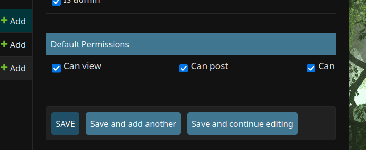
Checkboxes in admin panel extend off page depending on page size.
| Reported by: | ilar | Owned by: | nobody |
|---|---|---|---|
| Component: | contrib.admin | Version: | 5.0 |
| Severity: | Normal | Keywords: | admin, flex, checkboxes |
| Cc: | Triage Stage: | Unreviewed | |
| Has patch: | no | Needs documentation: | no |
| Needs tests: | no | Patch needs improvement: | no |
| Easy pickings: | no | UI/UX: | yes |
Description
Issue:
By default, a model with many checkboxes in Django Admin in a fieldset will extend off the page, clipping and causing you to lose inputs based off the number of bools and size of your screen.
The latter means you cannot get around it by trying to split them using ModelAdmin's fieldsets, because you don't know what kind of screen size the admin will be using.
It looks like it came about due to someone deleting flex-wrap: flex; from the admin css in https://github.com/django/django/commit/729266c6f29c7a0677b24926a86a767ef3078b26
This looks to be an extremely messy commit, as there are still flex attributes littered everywhere, orphaned by the change. The easy solution is to add flex-wrap back, but that may cause a reversion of the original bug.
Example images will be attached:
Attachments (7)
Change History (9)
by , 9 months ago
| Attachment: | image-20240427-055731.png added |
|---|
by , 9 months ago
| Attachment: | image-20240427-055752.png added |
|---|
by , 9 months ago
| Attachment: | image-20240427-055822.png added |
|---|
by , 9 months ago
| Attachment: | image-20240427-055852.png added |
|---|
by , 9 months ago
| Attachment: | image-20240427-060142.png added |
|---|
by , 9 months ago
| Attachment: | image-20240427-060225.png added |
|---|
by , 9 months ago
| Attachment: | image-20240427-060239.png added |
|---|
comment:2 by , 9 months ago
| Resolution: | → duplicate |
|---|---|
| Status: | new → closed |
Hi ilar 👋 thank you for the report and screenshots.
Was able to replicate the issue and confirmed is was introduced in 729266c6f29c7a0677b24926a86a767ef3078b26, this has been fixed on main as part of #35386.
Keep in mind that this website is cropping the images- you'll have to click them and scroll to see the whole issue.
Just before it transitions into mobile mode:

Slightly wider, about halfway to the third picture:

Fullscreen on a 1440p monitor.

Stretching it across multiple monitors to get the full list.

For the next set of pictures, they are the behavior before the commit mentioned above, at roughly the same screen sizes (except there is no fourth, because there's no reason to go that large.)


