Opened 15 months ago
Closed 15 months ago
#35004 closed Bug (fixed)
Arrows between "selector available" and "selector chosen" are backwards for RTL languages
| Reported by: | Natalia Bidart | Owned by: | Mariusz Felisiak |
|---|---|---|---|
| Component: | contrib.admin | Version: | dev |
| Severity: | Normal | Keywords: | rtl |
| Cc: | Tom Carrick, Shai Berger, Nick Pope | Triage Stage: | Accepted |
| Has patch: | yes | Needs documentation: | no |
| Needs tests: | no | Patch needs improvement: | no |
| Easy pickings: | no | UI/UX: | yes |
Description
While reviewing and debugging the PR for ticket #34995, I've noticed that the arrows to move objects between "selector available" and "selector chosen" (in M2M relationships) point to the wrong side for RTL laguages in "tablet size" screens. See screenshots attached.
Attachments (4)
Change History (15)
by , 15 months ago
| Attachment: | django-admin-wrong-arrow-direction-rtl.png added |
|---|
by , 15 months ago
| Attachment: | django-admin-wrong-arrow-direction-rtl-5.0.png added |
|---|
Example in Django 5.0
comment:1 by , 15 months ago
| Cc: | added |
|---|---|
| Severity: | Release blocker → Normal |
| Version: | 4.2 → dev |
Removing status of Release Blocker since the issue is also present in 4.1.
comment:2 by , 15 months ago
| Owner: | changed from to |
|---|---|
| Status: | new → assigned |
| Triage Stage: | Unreviewed → Accepted |
comment:3 by , 15 months ago
| Summary: | Admin: arrows between "selector available" and "selector chosen" are backwards for RTL languages → Arrows between "selector available" and "selector chosen" are backwards for RTL languages |
|---|
by , 15 months ago
| Attachment: | django-admin-wrong-arrow-rtl-before.png added |
|---|
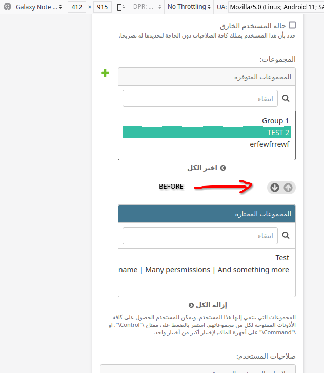
Arrows in small screen for RTL lang before 57c1dd466f
by , 15 months ago
| Attachment: | django-admin-wrong-arrow-rtl-after.png added |
|---|
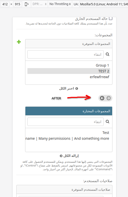
Arrows in small screen for RTL lang after 57c1dd466f
comment:6 by , 15 months ago
| Cc: | added |
|---|---|
| Resolution: | fixed |
| Status: | closed → new |
Mariusz, while the PR does fix the arrow direction in "medium" screens (tablet size for example), they are now weird in small screens (like phones, see screenshots). Before this change, the arrows would be "up and down" for small screen, and now they are "side to side" when the widgets are one on top of the arrows and the other below the arrows.
- Before 57c1dd466f change:
- After 57c1dd466f change:
comment:7 by , 15 months ago
| Has patch: | unset |
|---|
comment:11 by , 15 months ago
| Resolution: | → fixed |
|---|---|
| Status: | new → closed |


Example in Django 4.2