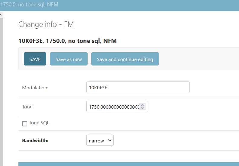
#34817 closed Uncategorized (invalid)
Boolean field doesn't look good on django-admin
| Reported by: | Rui Oliveira | Owned by: | nobody |
|---|---|---|---|
| Component: | contrib.admin | Version: | 4.2 |
| Severity: | Normal | Keywords: | |
| Cc: | Triage Stage: | Unreviewed | |
| Has patch: | no | Needs documentation: | no |
| Needs tests: | no | Patch needs improvement: | no |
| Easy pickings: | no | UI/UX: | yes |
Description
Change History (2)
comment:1 by , 18 months ago
| Resolution: | → invalid |
|---|---|
| Status: | new → closed |
comment:2 by , 18 months ago
| Component: | Uncategorized → contrib.admin |
|---|
Note:
See TracTickets
for help on using tickets.

Hello, thank you for your ticket.
There hasn't been changes regarding how boolean fields are displayed. If you have concerns from the usability point of view, please start a new post in the Django Forum, where you'll reach a wider audience and likely get richer feedback.